Re-inventing the FlickWheel
web experience
FlickWheel is the first of its kind in the industry. Come along and see how we changed the web experience resulting to 4000+ downloads on app store and google play


FLICKWHEEL AT A GLANCE
Transforming the auto tech industry in Lagos


Overview
This project took place between January and March 2022. I worked closely with the in-house team which included Henry Okafor, Jacinta Chianumba, Mary Okarethe and Steve Amire to brainstorm creative ideas and stir the boat in the right direction. I was responsible for the research, information Architecture, interaction design and user interface design.
My Role
Lead UI/UX Designer
Team
2 Designers, 4 Devs, 1 CTO
Timeline
Jan-Mar 2022
The communication Gap
As a pioneer product, the existing design failed to effectively communicate the unique needs the product had to offer. At a glance, users werent able to understand the platform. As team was under pressure as the bounce rate was high causing customer support issues.
The Beginning
We set up an interview session with the stakeholders to understand the goals and some of the issues the platform was facing. In order to communicate and position the platform as a pioneer product, we needed to ensure that the users understand what the company was all about, the target users and customers at the same time highlighting the selling point.
How can we engage users and drive more traffic to our application
Emphasising on the goals
Communicate to the users at a glance the selling point of the application
Deliver an intuitive user interface for new and old users.
Provide easy navigation and user friendly website experience
Provide easy navigation and user friendly website experience
Enlighten new and existing users about automotive technology
THE HEURISTICS
We decided to conduct a heuristics evaluation of the web experience in order to better identify and organise the areas of concern and reorganise the Information architecture. By doing this, there will be a clearer understanding of the functionality, navigation and other elements.
Navigation Bar
Home Page
Why FlickWheel?
VinCheck
Footer


HEURISTICS EVALUATION OVERVIEW
Problematic Areas
After thoroughly analysing the existing pages I organised the areas of concern
1
No clear understanding of what the platform was about and what services it offers.
2
Poor navigation experience
3
Not enough content and information on the page
4
Misuse of spacing and typography
5
Poor use of imagery
6
Disharmony of visual elements
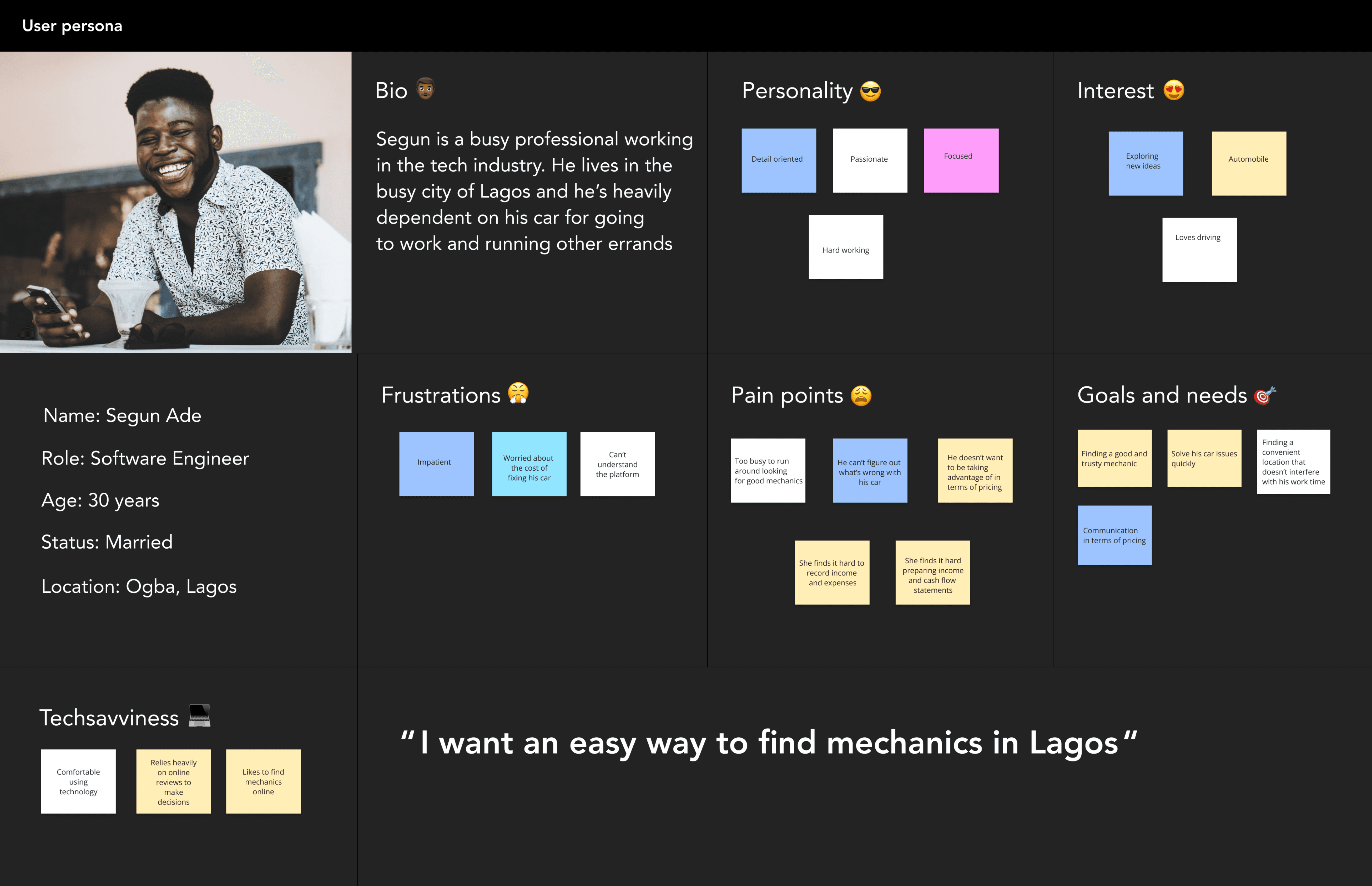
THE USERS
Understanding the users
User personas were referenced to guide the design direction and decisions. We created personas for our primary and secondary users
USER PERSONAS
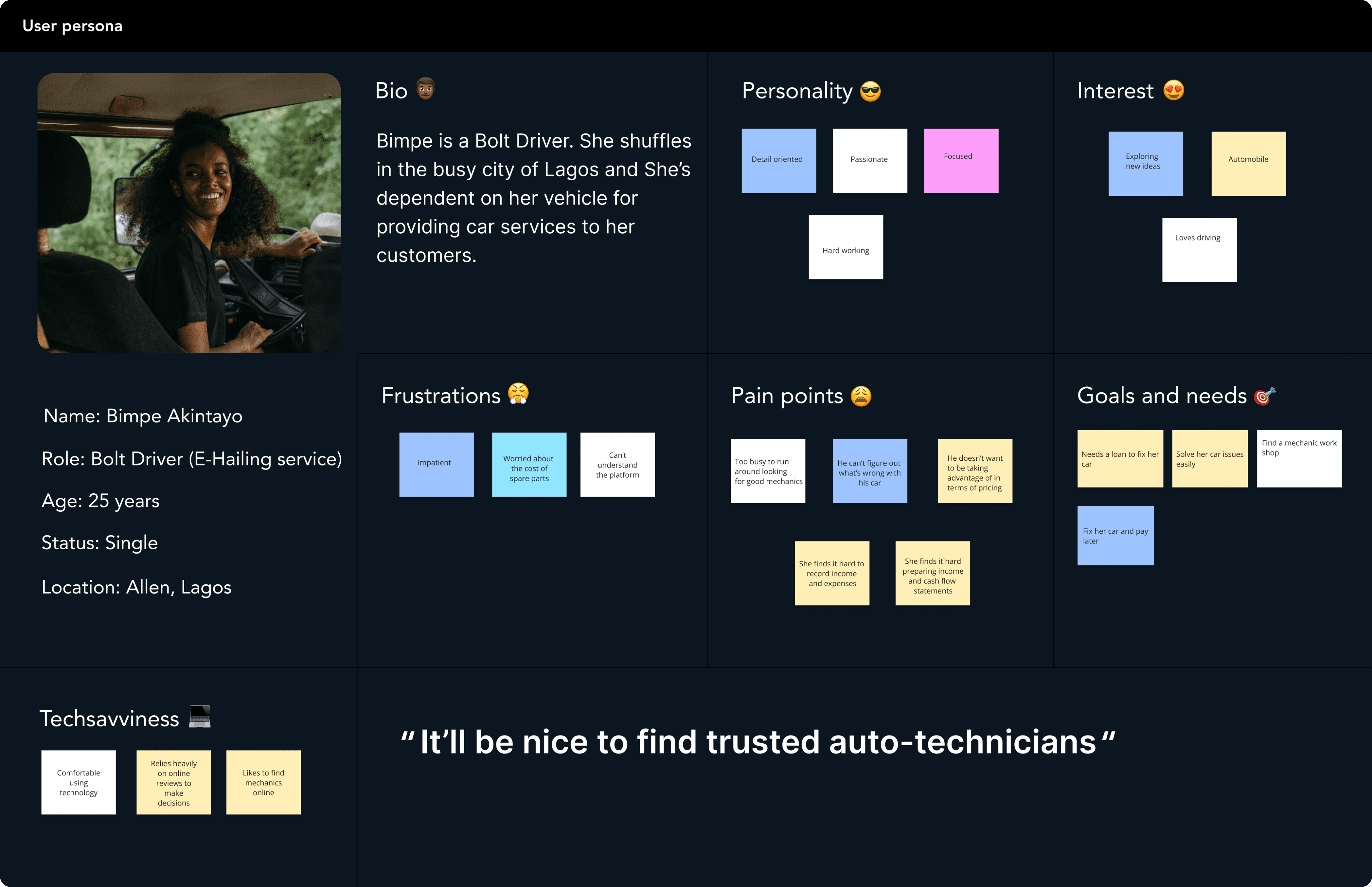
Primary User
Secondary User
Information Architecture
A clear sitemap was created using figjam in order to organise the web content and structure. These mainly involved important sections and how they interconnect.
The next step was to map the user flows to visualise how users would navigate through the website in order to achieve their goal. This helped us really identify to the potential pain points and optimise their journey.
Creating the sitemap
INFORMATION HIERARCHY AND USER FLOW

HERO SECTION
SECONDARY SECTION
ADDITIONALS
FOOTER
Paper doodles and sketches
I created some sketches showing several ideas describing the user experience. The sketches were shown to the team to get their input and feedback

Landing page sketch idea
Wireframes
Sketches to wireframes
I began by creating low-fidelity wireframes using figma. The major focus was on the structure of the layout for the hero section, content placement and basic functionality before moving to the visual design. These were the starting point for the discussions and iterations.
I collaborated with the stakeholders and gathered feedback on the wireframes. This process allowed me to refine the user experience based on insights.
WIREFRAMES SNIPPET SHOWING 3 IDEAS

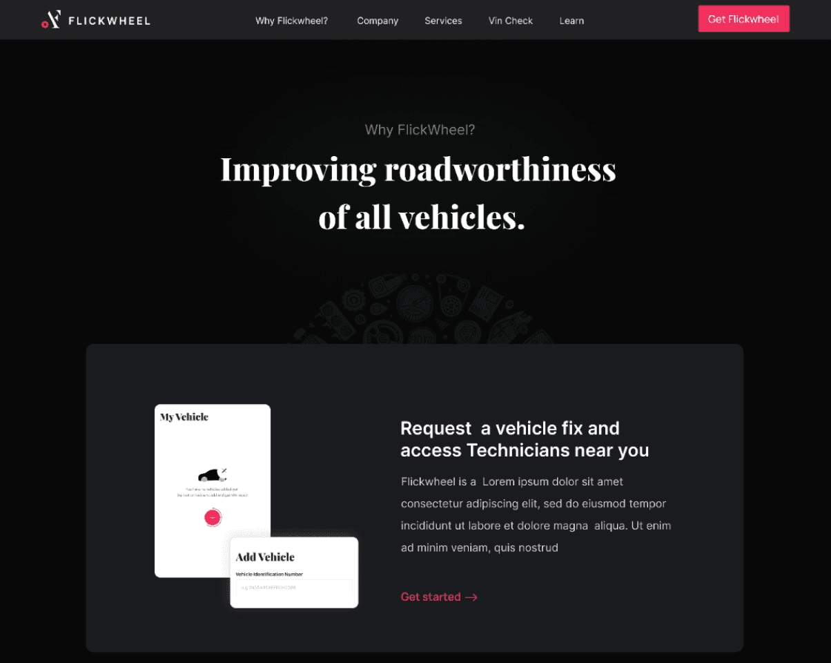
VISUAL DESIGN
Flickwheel already had an existing visual identity. Elements like colours, buttons, navigation bar, typograpghy and other visual elements were already present.
Using the wireframes as a foundation, I transformed them into high-fidelity mockups. These mockups showcased the final look of the website incorporating the visual identity and design elements.
Take a sneak peak at some of the elements that were redesigned
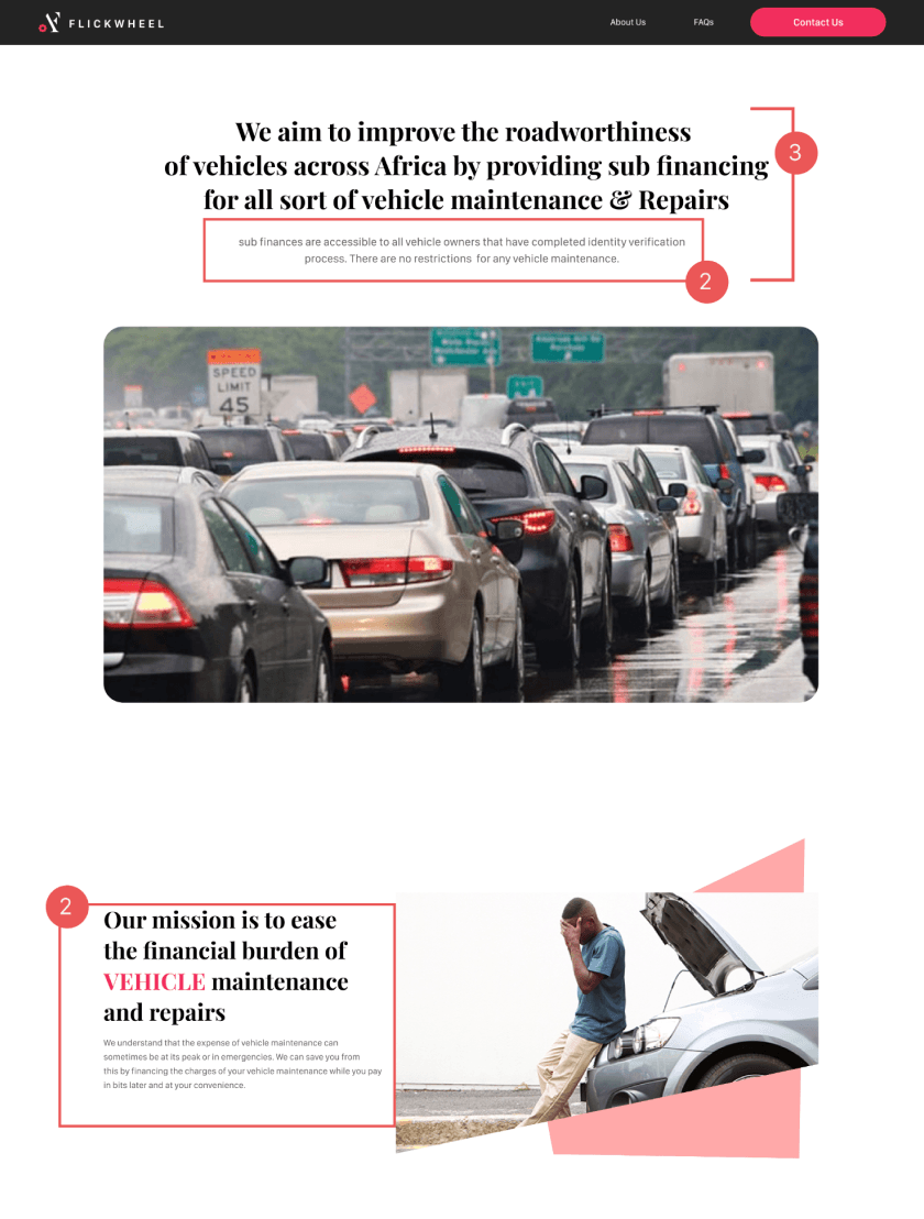
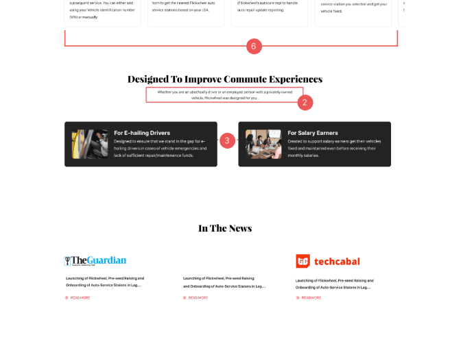
BEFORE & AFTER
BEFORE


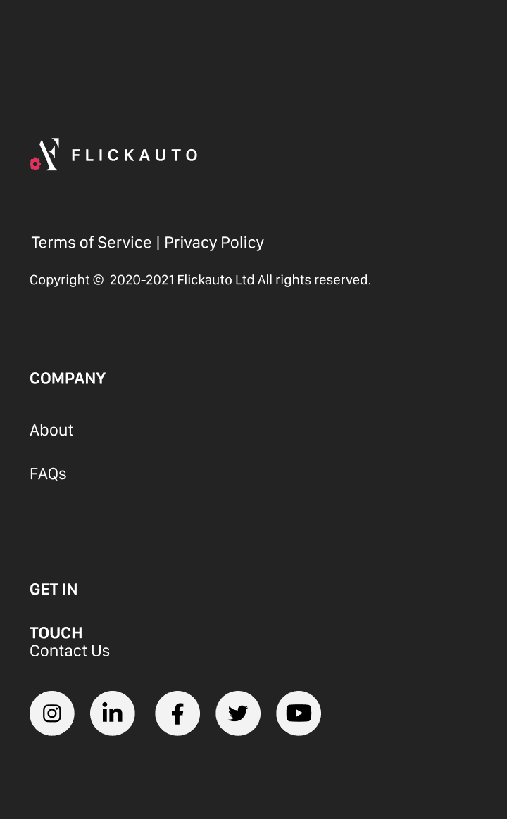

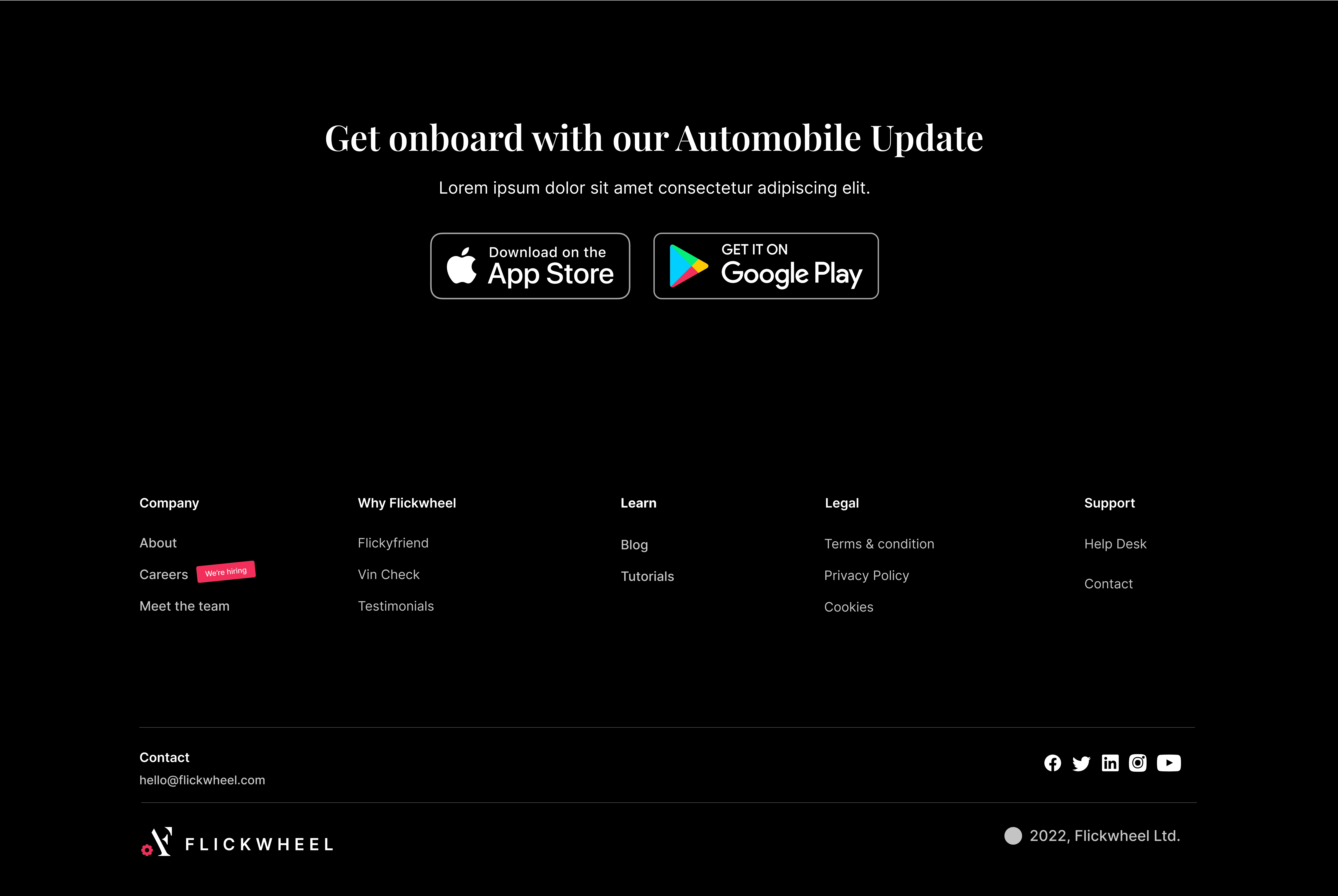
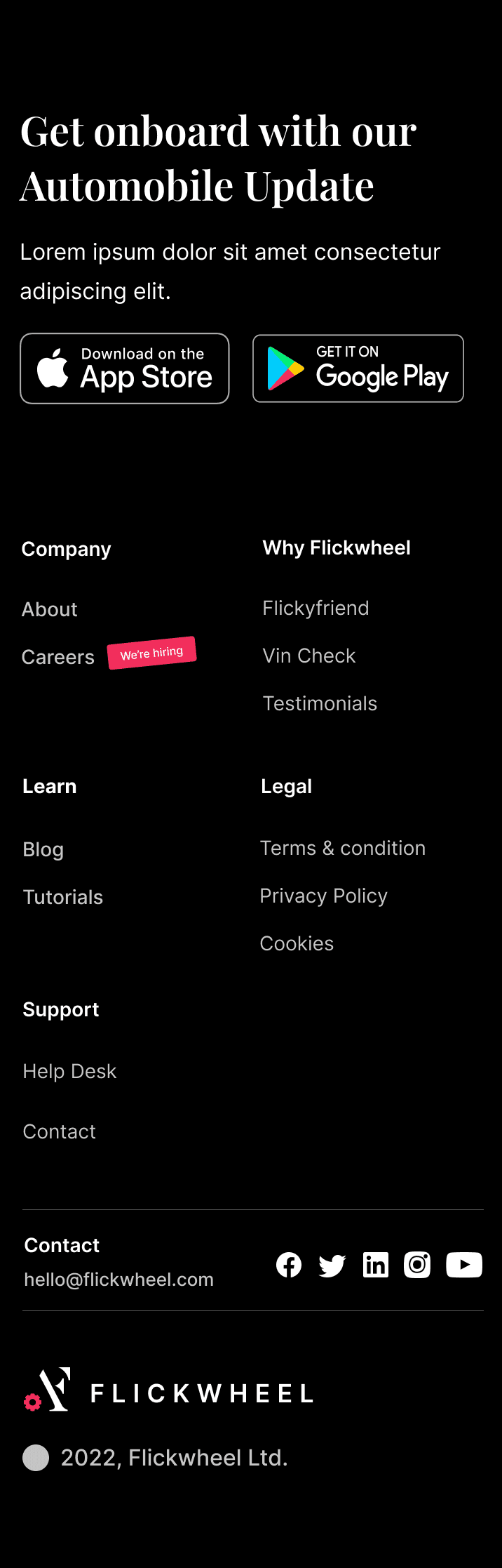
AFTER

Impact
After the launch of the new web experience, there was a postive impact on new and existing users. The result can be seen on Googleplay store

